Wednesday, October 05, 2011

Chrismons in Ink


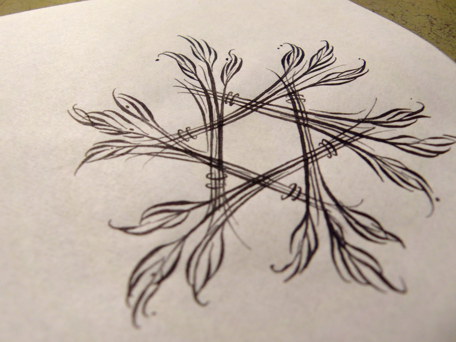
This week is devoted to inking up many of the Chrismons I've been commissioned to create. These will all be scanned in and cleaned up in Photoshop - things like smudges and dust and distractions that take from the overall piece will be delicately removed with a fine tooth comb.


The only one of these I'll need to redraw is the Easter Lily - I've got the leaves right, but the flower itself needs to be redrawn.


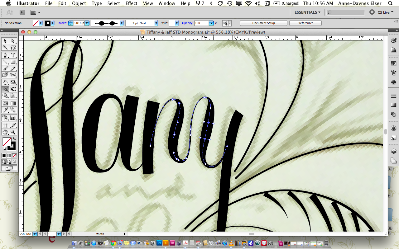
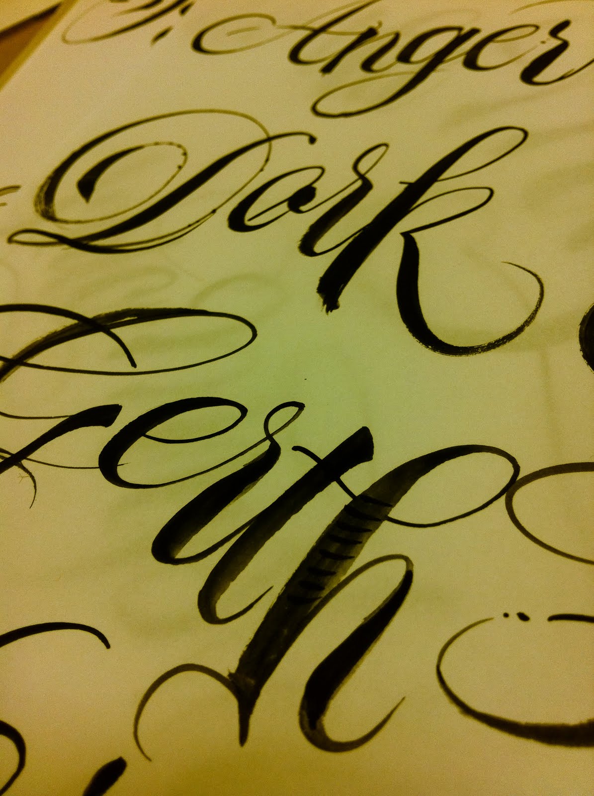
Inking a final in calligraphy is so rewarding, but tricky. It's an instantaneous process and one really has to warm up, loosen up and quietly focus before things really start to flow. I've had far more practice with a pencil, and to some degree, feel my pencil sketches are always better than the final work. But devoting this job to strictly to a pen and ink final, instead of a more graphic touch as in Adobe Illustrator, has been a real labor of love so far. It's a look I want to develop more and more and there is an elusive trust between your hands and the tools (paper, timing, ink, nib) that is so fine, so delicate, so instantaneous. It's broken very easily. But when you're in it - MAN, there is nothing like it. It's flow. It's god. It's trust. It's love.


Halloween Pin-Up Kickstarter Project

Friends! I have arrived at the pinnacle of my Calligraphic career having been dubbed a "Naughty Calligrapher" at last. Check out the project I'll be involved in - a Halloween-themed pinup coffee table book. I'll be painting live luscious models with all kinds of calligraphic phrases and more. Watch the video to see my hands in action (on paper.) And if you've got the energy in the form of green paper - why not fund!?

Sunday, October 02, 2011

Chrismons


These are the first sketches I'm developing for a set of Advent logos called Chrismons. The client, a beautiful and thriving church here in Atlanta, has commissioned me to create 11 marks within the theme "Rethink Advent."


My goal here for each overall look is that each have an interpretive, explosive expansiveness - each in a state of flowering growth and movement. That they are regenerative and ever-changing, expanding and evolving. There is no fear, nothing wrong or bad, no judgement. It's all beautiful.


Very exciting, because I've been trying to reframe Christmas these past years also. These will be part of a booklet the church is putting together and they'll all be calligraphic. I still don't know if I'll draw them with pen and ink or within Illustrator, and maybe I'll do a combination of the two. Who knows?


But they are fun. And it's been very refreshing to revisit these themes, now that my own idea of God has changed so much recently. I am beginning to feel a little more peace about my past. It's still all very good. All of it.


Tuesday, September 27, 2011

Hand Painted Monograms now in Subtle Color


I've recently taken the idea of a hand painted monogram a little further with the addition of color. These are turning out lovely and there is more experimentation I'd like to consider doing - mainly with the looser application of color.


These are pretty tight and delicate. I love them, but want to splatter the paint a little and treat the fabric as less precious. The direction will be in the example of the Bill & Tracey painted monogram you see below.


We buy practice paper for calligraphy experiments- why not treat fabric the same way? I can't buy a pad of fabric - so instead pick up linens at the thrift store to practice on. It's a great reuse and give me permission to play, with little expense. :)


New Copperplate Class Oct-Nov 2011


Hi Friends,

It's official! A new Copperplate Calligraphy class has been created and to sign up, you'll need to email Eli Pelizza directly at eli@bindersart.com.

The class is $190 and meets on Tuesday nights from 6-8:30PM.

You can get your supplies ahead of time or the first night of class with me touring you around the store. It's fun. :)

Here are the dates:

Oct. 11, Oct. 18, Oct. 25, Nov. 1, Nov. 8, Nov. 15

Below is a supply list and course description.

Happy inking!

~Anne

Calligraphy Two: Copperplate with Anne Elser

Beginner to Intermediate | Fee: $190 | Min. 3/ Max. 7

This is an introductory look at Copperplate, an elegant and elastic hand frequently used for formal invitations, documents and bridal events. Completely enchanting, the dramatic thicks and thins of this delicate hand will make you swoon.

During the six week course, students will be given handouts and guide sheets, learning the upper and lower case characters. We will also address spacing and layout for addressing envelopes.

Calligraphy is less about pretty handwriting, but more about DRAWING each and every letter. Its about establishing a pacing and rhythmic motion as you write - giving you a consistency of shapes and letters, and spaces in between words and lines. It is highly relaxing and meditative. Like yoga for the hands.


Monday, September 26, 2011

Calligraphic Kudos From Shira Savada


Anne Elser got a calligraphic kudos from Martha Stewart Wedding's editor Shira Savada recently on the PaperCupSketchbook.com blog from a story named "Inside Shira's Sketchbook." Can't resist sharing with all of you. :)

~Anne


Fabric Hankies & Hand Towels

New product from Anne Elser Calligraphy. Color version coming soon!


Sunday, September 18, 2011

My Naughty Ledger


Let me first say that this past Summer has been my busiest and most fulfilling yet as a professional calligrapher. The interest in the subject has recently exploded and I see no signs yet of it slowing. My Calligraphy classes are selling out at Binders and brides and their families are knocking excitedly at my door for work, work and more work. I am very happy. VERY happy.


Been taking more Calligraphy workshops because of this, and therefore, am learning as fast as I am creating. All new tricks to add to my toolbox and a wider range of products result for my customers.

My new mantra is "Invest in Your Value." And I am doing exactly that. Here is an example.

I have recently made a connection with one my of favorite erotica authors, Maren Smith and have found her to be just as gracious, fun, daring, witty and as wise as her work. I am making her a 8.5 x 11 journal with lined pages to use as a ledger for her ever-growing collection of published works. This book folds out to a very generous 17 x 11 spread, with lots of room in which to list, write, tabulate, etc. Her only request was to have the book covered in shades of blue and green and to include a quote on the inside about the inspiration of her craft. I kid you not, I wrote that quote out no less than FIVE times before I managed to NOT misspell a word. She and I had a good laugh over that.


This book is finished being stitched. I've only to paint the title "My Naughty Ledger" on the front cover and make a lovely simple case to protect it. I believe the case will have a window on the front, to reveal the title once inside. It's going to be splendid when finished and I can't wait to hear what she has to say about it once it's in her hands being used and loved for years to come.


I have another friend who has recently decided to seriously begin her career as a professional erotica author. I could not be more proud or excited for her. She's an amazing writer and has a lot of love and passion to give back to the world, as we all do.

I am so happy.


Saturday, September 17, 2011

New Monogram

New Calligraphic sketch for a monogram. This mark is begging for symmetry - I plan on curving the elements to the left of the B inward, pointing to the center of everything. And she loves this!

Monday, August 29, 2011

Italic Calligraphy: Calligraphy One

To sign up for the Wednesday evening class, Nov 14th -  Dec 19th, 2012, contact Jacob Gunter at Jacob@bindersart.com.


Calligraphy One: Italic with Anne Elser
Beginner to Intermediate | $190 | Min. 5/ Max. 8
The Italic calligraphic hand is one of the most widely used and versatile alphabets around. It is highly legible and can easily be dressed up or down. Italic is the perfect hand to learn for the beginning calligrapher yet versatile enough to experiment with for the advanced.
During the six week course, students will be given handouts and guide sheets, learning the upper and lower case characters. We will also address spacing and layout for addressing envelopes.
Calligraphy is less about pretty handwriting, but more about DRAWING each and every letter. Its about establishing a pacing and rhythmic motion as you write - giving you a consistency of shapes and letters, and spaces in between words and lines. It is highly relaxing and meditative. Like yoga for the hands.

Sunday, August 28, 2011

Palatial Palm Tree


It's finished! Save the Date monogram for a wedding in Miami. Stay tuned for the Invite monogram next.

Friday, August 26, 2011

Pixel/Paint

Working on a monogram today and within Illustrator CS5. With this new version comes a WIDTH tool and it's pretty amazing. It gives you the ability to mimic up and down strokes, creating stress where you want it. Totally different from what I used to do - trace the drawing from the outside contour. It feels more calligraphic now. Really, really interesting.


I love the asymmetry of this piece and can't wait to see how it changes when we do the wedding invitation version.


Thursday, August 25, 2011

An Amorous Palm Tree


New sketch for a couple to be wed in Miami, who asked for a monogram with palm leaf accents and tropical flair. I will bring this sketch into Illustrator today and have some fun. Wish me luck!

Friday, August 19, 2011

Tool Bed


A fellow dribbbler asked me recently to upload shots of the tools I use. This is a pouch Barbara Calzolari made to carry her own tools. She's an amazing Italian calligrapher from Bologna, who just did a workshop here in Atlanta at Binders called Pointed Pen Variation.

I traded a book I'd made for this pouch. The brushes I use for brush calligraphy are sized 00, 0, 1 and 2. The strange looking pen in the middle with the large screw at the top is called a Ruling Pen. It makes similar strokes that a brush makes and the screw increases or decreases the distance between the 2 parallel plates. Can be dipped in ink and drawn at the very tip for a fine line, or on the side at any angle. An amazing tool.

There are a couple of calligraphy pen holders next that are set at an oblique angle I use for Copperplate. In this oblique pen holder is a pointed pen nib. Currently my favorites are the Nikko G and the Zebra G nib.

For broad edge work I use a Brause nib. The three pens at the very end are automatic broad edge pens called Pilot Parallel pens. Another amazing tool.

This tool pouch came SPOTLESS with no ink spills, splatters or stains. That's how clean a good calligrapher keeps their tools. It's all about a sense of care, wonder and very good craft.


Wednesday, August 17, 2011

Brush Work


Writing with a brush is tough to learn. Creating interest in your strokes and crisp, defined marks is tricky, too. Been doing a lot of brush work practice lately, especially since Barbara Calzolari's Pointed Pen Variation Workshop.


She had me practicing with a brush, then the pointed pen and back again to the brush. They are essentially the same tool - just the brush is more sensitive. HIGHLY sensitive - which can be maddening. But it's good. I am in search of a brush lettering workshop and my goal is to take one from John Stevens.


While practicing with the brush, I started with black in. Then Barbara introduced me to the idea of using gouache. Now gouache is my preference. It makes my brush slow down because there is a slight chalky texture to it. It takes curves nice and slowly and I can feel the slight vibration in my hands. It's an amazing feeling.

I've been using the cheapest brushes I can find to practice with, but have just upgraded to a nicer version - Windsor Newton Series 7 Miniature Sable brushes in #00, 0, 1 and 2. They have a lovely waist on their short blue handles.


Monday, August 15, 2011

Hand Painted Calligraphy on Vintage Handkerchief


More hand painted calligraphy on fabric. Created with thinned fabric paint in black and white, onto a vintage linen handkerchief. I used a #0 brush, kept it clean and sharp and went very slowly.

This particular item is a gift to the Martha Stewart Weddings Magazine editor, Shira Savada. Came with my most recent package of calligraphy wedding envelope samples. Wish me luck!

Thursday, August 11, 2011

Hand Painted Monogram on Fabric


I am still digesting all of the fabulous things I learned from Barbara Calzolari's Pointed Pen Variation workshop last weekend. And I think you'll see a good many posts about the new tools and techniques I've adopted. My most urgent need was to get better at brush lettering. And this is a start. Barbara had me switch back and forth between the brush and nib - each sift improving the other. Then, with a very clean, size 0 brush, I used thinned fabric paint on this cotton doily. I am in LOVE. Will show you a handkerchief tomorrow. :)


Wednesday, August 10, 2011

Bjork: Virus


I have just listened to Bjork's new Biophilia single, "Virus" and am completely blown away. This is an enchanting, loving and entirely different view of our relationship with viruses. "My sweet adversary" nudges me closer to the opportunity illness brings. Take a deeper look at your body the next time you're down with the flu, sniffles or even something greater. Understanding always brings opportunity. Opportunity brings change. And that's a good thing.

Monday, August 08, 2011

Anton's first day of school!

My little bird goes to school (Coralwood) via school bus this morning. I kept it together until waving goodbye to him and blowing a kiss. Just feeling wonder at the flow of life - picking me up, picking Anton up - higher and higher and higher. I can't stop crying. Heavy morning.


And here he is coming home after a great first day. :) Sigh. Of. Relief.

Wednesday, July 27, 2011

Letter as Grape Vine

This is a new sketch for a Save The Date I'm currently working into. Delving into the twists and turns of William Morris patterns, I used his manner of bringing plant life to the surface as a breathing art form.


This couple share the same first letter in their last name, so when they told me they wanted a logo of a grape vine and leaves for their wedding materials, I thought it would be smart to combine the letterform with the plant. Theirs will be a destination wedding in a vineyard/flower farm in California.

Thursday, July 21, 2011

Address List Guide


Anne Elser Calligraphy Address List Guide

After you've reviewed what kind of etiquette guidelines you wish to follow (here's Crane's link to every etiquette question you can imagine), list and number your addresses as you want them to appear on your envelopes. List them in one column only and centered on the page without any other columns or notes. When numbering, you can put it on top of the address itself, so I know not to include it on the envelope. Numbering your list makes it easier for you and I to refer to a specific address quickly, if needed.
Your job will not begin until the address list is formatted in the manner you wish me to copy them.

My role in your envelope addressing is to provide technically accurate, legible, and aesthetically pleasing envelopes. If there are unmarked columns, unclear directions or handwritten notes in the list you provide me to copy, I must then attempt to interpret through the etiquette filter you have in mind, your intention for each address. My guess is not always accurate and misinterpretations are often made.

So before you provide your list, make sure it's one that I can literally copy word for word and line for line. Spell out words like Northwest, Road, and Street. Make sure the punctuation you provide falls within the etiquette standard you're comfortable with.

E-mail a PDF file of your list or provide a printed copy with your envelopes. If you have both outer and inner envelopes, list the outer first.

1.
Mr. & Mrs. Han Solo
311 Bright Tree Base
Endor Station, Endor

78621


Mr. and Mrs. Solo


2.
Tom and Glenda Headcold

5678 Achoo Lane

Atlanta, Georgia

30030


Tom and Glenda Headcold

Audrey


3.
The Honorable Padmé Amidala
Mr. Anakin Skywalker
36 Chommell Sector
Theed, Naboo

21174


Ms. Amidala

Mr. Skywalker

Wednesday, July 20, 2011

The Big C.


Hello Friends,

I have had a glass of wine, so I'll be braver than usual in this post.

If you are wondering why we are wearing pink in this picture, you guessed right - my mom has recently been diagnosed with breast cancer. I won't tell you what we were doing in the second picture down, but we were feeling frisky and bold and so that's enough details for now. :)

I just bought a copy of Louise Hay's Heal Your Body and accidentally bought two. Mom's getting my second copy. I don't ever want to get breast cancer, so I'm currently devouring Louise's love-infused wisdom and am totally blown away by her story of healing her own cancer. I am also buying a lot of pink things and sending prayers to my mother.

I am sad for my mother - who is robust and wild and loving and very, very funny. It's the quality I love in her most - her willingness to bring on the party. You'll hardly ever hear her say no.

I am thinking that this is a party of a different kind - one where she is gathering her cells together and putting tiny fuzzy pink hats on each one all the while oxygenating her blood through laughter, sleeping and healing and loving her body through this challenge.

I know there are many success stories for people fighting cancer. And I want hers to be one.

My husband Doug and sister-in-law Gloria are running the Chicago marathon this year in honor of Mom's battle with cancer, through the American Cancer Society. They have pledged, through forming "Team Nanny," (that's what her grandchildren call her) to reach their fundraising goal of $10,000.

If you would like to contribute to this story in a positive way through prayers, thoughts or a donation of any amount via this link to the Team Nanny page, all who love Nanny would love it, most especially her.

Sunday, July 17, 2011

Life Loves Me.


Life Loves Us.

And don't you forget it!

Methyl Cellulose & Sobo Glue Mixture


Follow this recipe for a brushable bookbinding glue mixture.

Mix one Tablespoon of Lineco's Methyl Cellulose powder with water. It'll be clumpy. Stir a little and let sit overnight. In the morning it'll be mixable enough to be smooth.
Then mix 3 parts Sobo Glue to 1 part Methyl Cellulose mixture.

If you're using Lineco's Neutral PH Adhesive, use less MC.
Try this ratio: 3.5 parts Neutral PH Adhesive to .5 part Methyl Cellulose mixture.

As you're working, your glue mixture will be continually exposed to air and will get thick and clumpy. Simply add a little of the MC mixture to thin it out again. This works both ways - if your glue is too runny, add more Sobo back in.

My favorite glue containers are the 2 cup Ziploc containers with a blue threaded lid. I put a little square of wax paper in between the lid and base as I close it. That way it's easier to open, when you're ready to work again.

And that's it! I've tried Elmer's glue, but it really isn't as nice. If you're en route and need an easy no-mess replacement, use Acrylic Gel Medium. It works great as a low-moisture adhesive, BUT will dry very quickly on your brush. Keep an eye on it as you're working.

~Anne


Friday, July 08, 2011

Brush Script Envelope


This inner envelope was done with a round brush and a healthy dose of black flourished ink. Making a statement to your guest that their name is beautiful enough to take up this much space on the page is loving in a dramatically generous way.