Dear Friends, It has been an incredible year of growth and I can hardly believe 2018 drawing to a close. My online presence has grown since I began teaching across the globe, and I have met the most wonderful people along the way. Below are the last of my 2018 courses. New here is FLORA II, an extension of FLORA. She'll return next year with bells on, along with all of my other classes, including new ones I have yet to talk about.
If you're hesitant to take an online class, I encourage you to do so. I have found it as enriching and engaging as meeting in person. For personal feedback, you can email me your work, and I will respond with comments. We all grow closer together with each class, and our conversations are so much fun, and healing, too.
We use Google Hangout to gather, and what you see on your screen is as crisp as what you see on a projected image were you looking at a wall in a room with other students. I also make a recording of every live class, which means that you can download or stream that recording for as long as you like, replaying it when it's convenient for YOU.
Above is a snapshot of what your screen will look like during class. Everyone has a box, and you can make each one larger by clicking on it, including mine. We open and close each class with a group discussion, then move right into warmups and guided tutorials that move at an easy pace, step by step.
Below are the new course descriptions. I wish all of you a happy remaining 2018 and look forward to more adventures in 2019!Much love, ~Anne

Class Schedule: We will meet Tuesday mornings from 10am-12:30pm EDT for the first three weeks, then 10am-12:30pm EST for the remaining 4. Our first meeting is a brief intro and dry-run test call on Tuesday Oct 16th from 10-11AM EDT. Course instruction officially begins the following Tuesday, Oct 23rd from 10-12:30AM EDT.
This course is presented to you at the request of my first batch of online FLORA students who did NOT want our 6 weeks to end. Truthfully, I didn't either! We'll be using the same handouts you've already recieved, but will be building upon that process to produce new foliage leaning into the FALL and WINTER holiday seasons. Think holly, apples, garlands, ribbons, evergreens, and all things pumpkin spice!
This is a LIVE class, which is recorded for your enjoyment and review, then uploaded to a class folder on my Dropbox site each of our 7 weeks of class time together. If you ever have to miss a class, you can always check back later to watch what you missed abd practice at your own pace. I really enjoy the live format, and meeting so many people all over the world each week in my home. Live classes allow the student to interact with me and each other for specific feedback.
When registration closes, I will email a permanent weblink to you. This will be our virtual classroom for every time we meet. When the link and intro email is sent to you, click the link, which will open a web page in your web browser. And that's it! Google may ask you to download their software and if they do, just follow their prompts.
Please read technical notes way down at the bottom for details about participating in an online class via Google Hangout.
Here's the class schedule (Please note the change in time from ED to ES):
Week 0 • Tuesday, Oct 16, 2018 ---> Google Hangout Dry Run Test Call (about an hour 10-11AM EDT
Week 1 • Tuesday, Oct 23, 2018 10AM-12:30pm EDT
Week 2 • Tuesday, Oct 30, 2018 10AM-12:30pm EDT
Week 3 • Tuesday, Nov 06, 2018 10AM-12:30pm EST
Week 4 • Tuesday, Nov 13, 2018 10AM-12:30pm EST
------- NO CLASS • Tuesday, Nov 20, 2018 ----------<-------- p="">
Week 5 • Tuesday, Nov 27, 2018 10AM-12:30pm EST
Week 6 • Tuesday, Dec 04, 2018 10AM-12:30pm EST
After you register and before the class begins, you will receive a welcome email containing:
• Link to our online classroom folder where you can find uploads each week and a PDF link to exemplar packet t download and print out for our first class.
• The Google Hangout Classroom link we will use every week.
After each live class, I’ll upload either a full-length recording of my demonstrations during the class OR a 20-minute review of the pages we worked on (and snapshots of those pages) for you to later download at your conveneince. This makes it easier for students to keep up with the class if you cannot participate live.
Note: these videos will take a day or two to appear in the class notes folder, as they are very large and take a long time for them to fully upload onto my Dropbox account. Please allow for at least a day and a half after a class date before you go searching for any content of that class.
Welcome to FLORA with Anne Elser! •
“In every walk with nature, one receives far more than he seeks.“ -John Muir
“You do not have to be good.
You do not have to walk on your knees
for a hundred miles through the desert, repenting.
You only have to let the soft animal of your body
Tell me about despair, yours, and I will tell you mine.
Meanwhile the world goes on.
Meanwhile the sun and the clear pebbles of the rain
are moving across the landscapes,
over the prairies and the deep trees,
the mountains and the rivers.
Meanwhile the wild geese, high in the clean blue air,
Whoever you are, no matter how lonely,
the world offers itself to your imagination,
calls to you like the wild geese, harsh and exciting –
over and over announcing your place
in the family of things.” - Wild Geese by Mary Oliver
Flora was born on the heels of my course “Love, Fear, and Flourishing” after a solid year of working with students from all over, who saw (many of them for the first time) the freedom an oval provides when harnessing the power of the flourish and how it relates to our lettering.
Flora is also a direct extension of “Mono Linear Lettering: Cursive Crush & Open-Shaded Script” in that we move closer to painting with the aid of a mono line celebrated with a watercolor PENCIL and awakened gently with a fine pointed brush. This two-step process is as pleasurable as it is fascinating and it is my deepest desire that you discover more of yourself in the gentle forms of curving leaves, folding petals, and sweeping stems, all along the oval paths of your letter forms and flourishes.
FLORA is a feminine personification of the healing powers of nature, and draws upon the texture florae make available when looking for a way to fill out and make more dense, our work. FLORA is first drawn with our oldest friend, the pencil - that pressure-sensitive, soft, blunt stick we are all more familiar with than most - the tool we held as toddlers that made our first marks on paper - the beloved crayon, pencil, or colored pencil.
But now that we are grown-ups, why be satisfied with a mere pencil, when you can use a watercolor pencil, right?!
The watercolor pencil’s unique gift is that it can be awakened with water, and not only that, but it can change when that water carries with it another pigment. We will use soft oval-shaped curves to describe absolutely every space-filling element on the page and with every stroke, you’ll find yourself allowing, as Mary Oliver so eloquently states, “the soft animal of your body (to) love what it loves.”
This is my prayer and goal in teaching FLORA. I am sharing with you, my personal mode of self care and healing. FLORA is what I do each and every morning as I sit by the fire to journal. I use her to process my thoughts, to welcome the day, to asks for grace, and to find the silver lining in everything that crosses my path. She is a gentle way for me to try on larger, braver strokes. She’s soft, adaptable, and portable. FLORA requires paper, a small brush, pencil, one cake of watercolor, a small amount of water, and my newest friend: you.
• A student needs to have taken “Mono Linear Lettering: Cursive Crush & Open-Shaded Script”, before taking FLORA. If you’ve already taken Flourishing, that’s great - but if not, take that next!
• $8 Fee due (in-person Atlanta students only) to the instructor on the first day of class or workshop.
• If you’re in Atlanta, Anne will be bringing her dog to this class. If you have an allergy or phobia that she needs to be aware of, please email Anne directly. Penkitten@anneelser.com
After earning a BFA in painting from the Cleveland Institute of Art and graduate studies in Graphic Design at The Portfolio Center, Anne Elser began her artistic career as a painter, bookbinder, designer, and calligrapher. With over 20 years teaching experience, her students often report how fulfilling the classroom experience is, prompting both personal and artistic transformations. Anne's classes are also FUN and full of laughter. Students find the sense of community she inspires enriching and entertaining.
She currently teaches private lessons from her home studio in Decatur, classes and workshops year round at Binder Art Supply in Buckhead and at their Ponce City Market location, as well as Thursday afternoon classes at The Spruill Center for the Arts, and classes and workshops at Aikido Decatur. She also travels in the states and abroad conducting workshops.
Her work has been featured in books and magazines across the country, and for both private and corporate clients such as Tiffany&Co, Mont Blanc, Louis Vuitton, Paces Papers, Landor, Martha Stewart Weddings, Belk, Saks Fifth Avenue, Bloomingdales, Clicquot Veauvé, World50, Ogilvy, and more.
Artist, calligrapher, teacher, mother, and friend, Anne believes making art creates a channel for truth and is a soulful reflection of the connections shared by all.
Binders Art Supply (bindersart.com) is the best local spot to purchase supplies for this class and they will give you a student discount! Anything that you can’t find there, can be purchased online at amazon.com, John Neal Books (johnnealbooks.com) or Paper and Ink Arts (paperinkarts.com).
PAPER----------------------------
Transparent Marker Paper: great for tracing and warm-ups. Can withstand a VERY small amount of paint for experimenting and warming up, but not great for final work as it gets quite wrinkly when wet. Suggested brands below, but use whichever brands you’re comfortable with.
• Bienfang Graphics 360 9’’x12’’ Marker Pad
or Borden & Riley 9’’x12’’ 100s Smooth Cotton Comp Pad
Slightly Nicer Paper (great for envelopes and journals):
Get at least one of these and if you’re feeling frisky, both.
• Strathmore Calligraphy Pad. I LOVE this ivory laid sheet that comes in a nifty pad. She’s super for folding envelopes and can handle more watercolor than the transparent pad above. Not great for final work (will wrinkle some) but if you already have these sheets, you may use these.
• Classic Crest Antique Gray, Smooth Writing Paper, 24W. Neenah Paper (neenahpaper.com) sells this by the 500-sheet ream at $33.95 (item #01361). It’s what I use in my sketchbooks each morning. This paper does well with fountain pen ink, and can also stand a bit of water color.
Watercolor or Printmaking Paper for Final Work:
Any Hot Press (smooth) watercolor paper will perform very well. Below are brands I’ve used and liked. You’ll want to have at least ten 8.5 x 11 sheets of either of these.
• Arches BFK Rives White Velin paper 19 x 26 sheets that I cut down to 8.5 x 11 or smaller. I love this paper because it’s thin, soft, and folds easily and isn’t as expensive as watercolor paper. Save the scraps for testing colors. Note that this paper is very unsuitable for pointed pen - so if you want to add pointed pen embellishments to your work, use a hot press watercolor sheet instead.
• Arches or Fabriano Artistico 140 lb Hot Press Watercolor Paper cut down to 8.5 x 11 or smaller.
PENCILS-------------------------
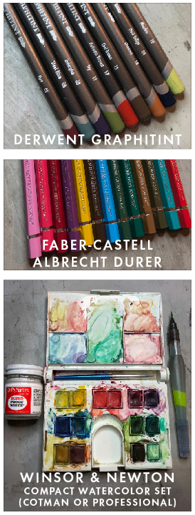
Watercolor Pencils: I use 2 brands for different purposes.
• Derwent Graphitint Watercolor Pencils: These are soft and creamy and I rarely sharpen them to their finest point. These loosen more easily into paint and I use them a lot.
Colors I use frequently: Port (01), Steel Blue (06), Aubergine (03), Ivy (11), Autumn Brown (17), Cool Brown (15), Chestnut (13), Dark Indigo (04), Meadow (10).
• Faber-Castell Albrect Durer Watercolor Pencils: These are a harder pencil that I use more for adding crisp, sharp details when finalizing a piece.
Colors I use frequently: Light Magenta (119), Rose Carmine (124), Dark Red (225), Manganese Violet (160), Dark Naples Ochre (184), Burnt Umber (280), Light Phthalo Blue (145), Juniper Green (165), Chrome Oxide Green Fiery (276), Raw Umber (180), Olive Green Yellowish (175), Cobalt Green (156), Deep Scarlet Red (219).
PAINT----------------------------
• Dr. Martin’s Bleedproof White I scoop out a dab to my watercolor palette and let it dry in each corner of my mixing tray. This makes a great white to mix in with any of your watercolors.
Watercolor Pan Set: (NOTE - IF YOU ALREADY HAVE ONE YOU LIKE, FEEL FREE TO USE IT INSTEAD OF THIS ONE!)
• Winsor & Newton Professional OR Cotman (student-grade) Watercolors Compact Set with 14 half pans. There IS a price difference between professional ($75) and student grade ($20). I’ve been using the student grade just fine. I’ll upgrade to professional in the near future.
BRUSH----------------------------
• Pentel Aquash Water Brush - FINE.
MISCELLANEOUS---------------
• Mechanical pencil to line paper
• White or kneaded eraser
• Washi Tape and postage stamps for envelopes
Google Hangout Technical Notes:
For the Google Hangout to work, you'll need to be using a set of headphones during demo time to plug into your computer. During instruction, your microphones should be muted, but cameras on. This cuts down on background noise while I am demonstrating. However, when we begin introductions, and for class discussion after each exercise is completes, you should be unmuted so we can all have a lively disucssion! So please purchase a pair of earbuds if you don't already have a set.
Click here to read what Google has to say about participating in a
Google Hangout. From my experience, here are some things you can do to improve your online experience and some trouble shooting if any technical issues come up.
• Quit all other open applications on your device that are actively using the internet.
• Ask other members of your household not to use the internet/wifi while you're streaming the class
• Make sure you're as close as you can get to your router (that box that has all the wires and gives you wifi). You can still have a good connection to your router of it's in a different room in your home, but large mirrors and other large devices can interfere with reception. Note that you may have great success even without taking these measures - this is just my practice here at home.
• If your connection isn't the greatest (poor image or no sound/video), hang up the call and return. Upon returning, if it hasn't improved, quit your browser and restart your computer. That ALWAYS helps.
• If your camera suddenly goes blank, use the camera icon at the top of your screen to toggle it off and on again.
Are there ID or minimum age requirements to enter the event?
This is an adult class. Childrens classes coming soon!
What are my transportation/parking options for getting to and from the event?
How can I contact the organizer with any questions?
Send Anne an email to: PenKitten@Anne Elser.com
What's the refund policy?
Refunds are not available at this time.
Do I have to bring my printed ticket to the event?
Is my registration fee or ticket transferrable?
Is it ok if the name on my ticket or registration doesn't match the person who attends?
Yes. If you purchased this class or workshop as a gift, please let me know the name of the person taking the class when you register.
If this is an online class and I can't be there live, how do I participate?
Every single class is live so that we can all interact with each other. I record EVERY class and upload this file immediately after class ends. You may stream the recording and you may also download and keep it. I record my classes so that students can still participate if they can't attend because of illness, time zone differences, or other issues. If in the event a recording malfunction occurs, I upload a brief review of the class, using the notes and pages I already created. I also upload images of my pages for you to view and keep for your personal use. If you can't be there.
How do I participate in the envelope exchange at the end of the class?
You must be in the live class to participate int he weekly envelope exchange. You must also add your mailing address to the dropbox file we create during our first intro meeting. You can leave your mailing address as a comment. Please be sure to cover up a portion of the envelope addres if you'd like to share your work via social media.
How do I receive feedback on my homework?
You may upload your homework and share on social media but if you'd like me to see it, you need to TAG ME. (@anneelser) on Instagram or Anne-Davnes Elser on Facebook. This is a wonderful way to keep in touch with the progress of your classmates and with me! If you'd rather be more private, go ahead and email me your work and we can correspond that way.
How soon after a class ends, will I be able to view it online?
It generally takes 12-24 hours for a class recording to fully upload.

This class or workshop is suitable for calligraphers, tweens, and all adults.
Class Schedule: We will meet Tuesday evenings from 6PM-8:30PM EDT for EDT for the first three weeks, then 6PM-8:30PM EST for the remaining 4. Our first meeting is a brief intro and dry-run test call on Tue Oct 16th from 6-7pm EDT. Course instruction officially begins the following Tuesday, Oct 23rd and goes from 6pm-8:30pm EDT.
This is a LIVE class, which is recorded for your enjoyment and review, then uploaded to a class folder on my Dropbox site each of our 6 weeks of class time together. If you ever have to miss a class, you can always check back later to watch what you missed abd practice at your own pace. I really enjoy the live format, and meeting so many people all over the world each week in my home. Live classes allow the student to interact with me and each other for specific feedback.
When registration closes, I will email a permanent weblink to you. This will be our virtual classroom for every time we meet. When the link and intro email is sent to you, click the link, which will open a web page in your web browser. And that's it! Google may ask you to download their software and if they do, just follow their prompts.
Please read technical notes way down at the bottom for details about participating in an online class via Google Hangout.
Here's the class schedule:
Here's the class schedule (Please note the change in time from ED to ES):
Week 0 • Tuesday, Oct 16, 2018 ---> Google Hangout Dry Run Test Call (about an hour 6-7PM EDT
Week 1 • Tuesday, Oct 23, 2018 6pm-8:30pm EDT
Week 2 • Tuesday, Oct 30, 2018 6pm-8:30pm EDT
Week 3 • Tuesday, Nov 06, 2018 6pm-8:30pm EST
Week 4 • Tuesday, Nov 13, 2018 6pm-8:30pm EST
-------> NO CLASS • Tuesday, Nov 20, 2018 <-------- p="">
Week 5 • Tuesday, Nov 27, 2018 6pm-8:30pm EST
Week 6 • Tuesday, Dec 04, 2018 6pm-8:30pm EST
Shortly before our first class you will receive a welcome email containing:
• PDF link to exemplar packet.
• Link to our Online Classroom
• Link to Online folders where class recordings are kept
After each live class, I’ll upload either a full-length recording of my demonstrations during the class OR a 20-minute review of the pages we worked on (and snapshots of those pages) for you to later download at your conveneince. This makes it easier for students to keep up with the class if you cannot participate live.
Note: these videos will take a day or two to appear in the class notes folder, as they are very large and take a long time for them to fully upload onto my Dropbox account. Please allow for at least a day and a half after a class date before you go searching for any content of that class.
The speed of digital communication today has gifted us with more time to pursue things we love. But somewhere along the way, we’ve forgotten how good it feels to use a writing instrument to record our thoughts for ourselves and to those we love. Writing, and the time it takes to produce letterforms, is good for the body, mind, and spirit. It is also a gift to the recipient, who holds your elevated thoughts in their hands, literally, and with far more consideration and pause than through a text or email.
The child of Spencerian calligraphy, Cursive Handwriting is not forgotten, because we have made a table for you to come join us in one fun and joyous day of lettering. Students will learn (or re-learn!) capitals and lower case letterforms, through formal exercises in structure, rhythm and flow - all standards similar to those taught not that long ago.
Time is spent on spacing and lower case characters. Later we’ll dance with capitals and dive right into an envelope addressing/letter writing project.
Week 4-6: Open-Shaded Script
The second half of this class or workshop is spent on the construction of open-shaded letterforms based on principles of script writing done with pointed pen.
Using a mono linear tool to describe the contour of a shaded stroke offers insight into its construction with its native tools, the broad-edge, pointed pen, or paint brush. Drawing these letter forms is not only useful in sketching out and planning of larger projects to be later filled in with ink, I believe they are also valid and beautiful class of letter forms in and of themselves. Because these letter forms are drawn with tools more commonly used today, they are the style I use more frequently in my every day writing, and therefore, have become more useful and precious to me than anything created with a dip pen. I am constantly writing letters and notes, whether on a chalkboard for my students, wedding signage for clients, fabric labels, canvas bags, handkerchiefs, monograms, journal pages, letters to friends, and much more.
Rendering a shade with a contour line offers the artist another opportunity to love the letter and learn more about the letter, and deepen your understanding of its relationship with other forms and unique features. Expression of the universal line of beauty need not be restricted to our ability to carry a pointed pen and ink well around with us every day. We can, with any mono linear tool and at any moment, study and celebrate our love of these forms with a crayon on the back of a paper menu, a pencil at the top of a grocery list, a marker labeling a box of preserved memories or a bag of home-made treats for a friend, the inside label of our child’s school uniform, every page in our journal entries, letters to friends, notes to beloved partners, and even our fingers in the sand.
• Bienfang Graphics 360 9’’x12’’ 100% Rag Marker Pad OR Borden & Riley 9’’x12’’ 100s Smooth Cotton Comp Pad
Paper for envelopes and final projects: Pick at least one
or ALL if you’re wanting to try a variety.
• Strathmore Calligraphy Writing Paper Pad 8.5 x 11.
• Classic Crest Antique Gray 24 lb. Smooth Writing Paper. This comes in a ream of 500 8.5 x 11 sheets and works very well with fountain pen ink. Buy at www.neenahpaper.com.
• Southworth Resumé paper by Neenah. Office Supply stores sell this as well as amazon.com. Comes in white or ivory and has two weights: 24lb and 32 lb. I’ve used both for folding letters/envelopes.
• Optional Letter-writing paper or for practice:
Fidelity Onion Skin Paper. I LOVE, LOVE, LOVE this stuff. Purchase at ThePaperMillStore.com. Item # ONSKN-N. It’s very thin and a delight to write on with a fountain pen and is VERY transparent. I use this for writing letters and for practice during class.
• My ultimate favorite mono linear tool is a fine-nib fountain pen. Mine is a MontBlanc LaGrande Meisterstuck. I’ve had students who have taken this course tell me that once they invested in a fountain pen, they set aside all the pens they had been using at home because a fountain pen is luxurious to write with as it glides across paper and as the wet ink dries and pools at the end of a stroke. You don’t need an expensive one. Start with a Lamy on the low end (Amazon and jetpens.com are both great places to look.) For ink, my faves are transparent grey inks: MontBlanc/Oyster Grey and Kiri-Same/Iroshizuku. These come in bottles and you’ll have to make sure you get a converter for your fountain pen instead of a box of cartridges, so you can fill your pen with bottled ink (more economical but a little more high-maintenance.)
• A variety of ultra fine, fine, and medium point pens (for wide markers make sure to get bullet point and not chisel). These need to be your favorites. Listed below are pens I’ve loved and used in the past.
• Pentel Slicci 025 pen (Super ultra tiny, smooth and can be scratchy if you press too hard. Wonderful for precise and tiny lettering.)
• Pentel Hybrid Technica pen
• Sakura Gel Pens. My faves are the Black Glaze and white (the white looks pretty boss on black paper).
• Mechanical Pencil (for drawing guides.)
• Decorative Washi Tape (for envelopes.)
• Bone Folder (for envelopes.)
• Postage Stamps (for envelopes.)
Google Hangout Technical Notes:
For the Google Hangout to work, you'll need to be using a set of headphones during demo time to plug into your computer. During instruction, your microphones should be muted, but cameras on. This cuts down on background noise while I am demonstrating. However, when we begin introductions, and for class discussion after each exercise is completes, you should be unmuted so we can all have a lively disucssion! So please purchase a pair of earbuds if you don't already have a set.
Click here to read what Google has to say about participating in a
Google Hangout. From my experience, here are some things you can do to improve your online experience and some trouble shooting if any technical issues come up.
• Quit all other open applications on your device that are actively using the internet.
• Ask other members of your household not to use the internet/wifi while you're streaming the class
• Make sure you're as close as you can get to your router (that box that has all the wires and gives you wifi). You can still have a good connection to your router of it's in a different room in your home, but large mirrors and other large devices can interfere with reception. Note that you may have great success even without taking these measures - this is just my practice here at home.
• If your connection isn't the greatest (poor image or no sound/video), hang up the call and return. Upon returning, if it hasn't improved, quit your browser and restart your computer. That ALWAYS helps.
• If your camera suddenly goes blank, use the camera icon at the top of your screen to toggle it off and on again.
•
Anne Will be bringing her dog to this class. If you have an allergy or phobia that she needs to be aware of, please email Anne directly. Penkitten@anneelser.com
After earning a BFA in painting from the Cleveland Institute of Art and graduate studies in Graphic Design at The Portfolio Center, Anne Elser began her artistic career as a painter, bookbinder, designer, and calligrapher. With over 20 years teaching experience, her students often report how fulfilling the classroom experience is, prompting both personal and artistic transformations. Anne's classes are also FUN and full of laughter. Students find the sense of community she inspires enriching and entertaining.
She currently teaches private lessons in person and on-line from her home studio in Decatur, classes and workshops year round at Binder Art Supply in Buckhead and at their Ponce City Market location, occasional workshops at The Spruill Center for the Arts, and classes and workshops at Aikido Decatur. She also travels in the states and abroad conducting workshops.
Her work has been featured in books and magazines across the country, and for both private and corporate clients such as Tiffany&Co, Mont Blanc, Louis Vuitton, Paces Papers, Landor, Martha Stewart Weddings, Belk, Saks Fifth Avenue, Bloomingdales, Clicquot Veauvé, World50, Ogilvy, and more.
Artist, calligrapher, teacher, mother, and friend, Anne believes making art creates a channel for truth and is a soulful reflection of the connections shared by all.
Are there ID or minimum age requirements to enter the event?
This is an adult class. Childrens classes coming soon!
What are my transportation/parking options for getting to and from the event?
How can I contact the organizer with any questions?
Send Anne an email to: PenKitten@Anne Elser.com
What's the refund policy?
Refunds are not available at this time.
Do I have to bring my printed ticket to the event?
Is my registration fee or ticket transferrable?
Is it ok if the name on my ticket or registration doesn't match the person who attends?
Yes. If you purchased this class or workshop as a gift, please let me know the name of the person taking the class when you register.
If this is an online class and I can't be there live, how do I participate?
Every single class is live so that we can all interact with each other. I record EVERY class and upload this file immediately after class ends. You may stream the recording and you may also download and keep it. I record my classes so that students can still participate if they can't attend because of illness, time zone differences, or other issues. If in the event a recording malfunction occurs, I upload a brief review of the class, using the notes and pages I already created. I also upload images of my pages for you to view and keep for your personal use. If you can't be there.
How do I participate in the envelope exchange at the end of the class?
You must be in the live class to participate int he weekly envelope exchange. You must also add your mailing address to the dropbox file we create during our first intro meeting. You can leave your mailing address as a comment. Please be sure to cover up a portion of the envelope addres if you'd like to share your work via social media.
How do I receive feedback on my homework?
You may upload your homework and share on social media but if you'd like me to see it, you need to TAG ME. (@anneelser) on Instagram or Anne-Davnes Elser on Facebook. This is a wonderful way to keep in touch with the progress of your classmates and with me! If you'd rather be more private, go ahead and email me your work and we can correspond that way.
How soon after a class ends, will I be able to view it online?
It generally takes 12-24 hours for a class recording to fully upload.

Class Schedule: We will meet Wednesday evenings from 6-8:30pm EDT for the first 2 classes, and then 6-8:30PM EST for the remaining 4. Our first meeting is a brief intro and dry-run test call on Wednesday Oct 17th from 6-7PM EDT. Course instruction officially begins the following Wednesday, Oct 24th from 6-8:30PM EDT.
This is a LIVE class, which is recorded for your enjoyment and review, then uploaded to a class folder on my Dropbox site each of our 7 weeks of class time together. If you ever have to miss a class, you can always check back later to watch what you missed abd practice at your own pace. I really enjoy the live format, and meeting so many people all over the world each week in my home. Live classes allow the student to interact with me and each other for specific feedback.
When registration closes, I will email a permanent weblink to you. This will be our virtual classroom for every time we meet. When the link and intro email is sent to you, click the link, which will open a web page in your web browser. And that's it! Google may ask you to download their software and if they do, just follow their prompts.
Please read technical notes way down at the bottom for details about participating in an online class via Google Hangout.
Here's the class schedule (Please note the change in time from ED to ES):
Week 0 • Wednesday, Oct 17, 2018 ---> Google Hangout Dry Run Test Call (about an hour 6-7pm EDT
Week 1 • Wednesday, Oct 24, 2018 6-7pm EDT
-------> NO CLASS • Wednesday, Oct 31, 2018 <-------- p="">
Week 2 • Wednesday, Nov 07, 2018 6-7pm EDT
Week 3 • Wednesday, Nov 14, 2018 6-7pm EST
-------> NO CLASS • Wednesday, Nov 21, 2018 <-------- p="">
Week 4 • Wednesday, Nov 28, 2018 6-7pm EST
Week 5 • Wednesday, Dec 05, 2018 6-7pm EST
Week 6 • Wednesday, Dec 12, 2018 6-7pm EST
After you register and before the class begins, you will receive a welcome email containing:
• Link to our online classroom folder where you can find uploads each week and a PDF link to exemplar packet t download and print out for our first class.
• The Google Hangout Classroom link we will use every week.
After each live class, I’ll upload either a full-length recording of my demonstrations during the class OR a 20-minute review of the pages we worked on (and snapshots of those pages) for you to later download at your convenience. This makes it easier for students to keep up with the class if you cannot participate live.
Note: these videos will take a day or two to appear in the class notes folder, as they are very large and take a long time for them to fully upload onto my Dropbox account. Please allow for at least a day and a half after a class date before you go searching for any content of that class.
Calligraphic Flourishing Course Description:
The definition of flourish is to flower. We all flower in our language, thoughts, hopes and dreams, body movements, voices, and in our relationships with each other and the beautiful big world we share. But most importantly, we flourish all by ourselves - our bodies do this automatically - we were built this way. Look at the branching of blood vessels in our bodies, how our fingers splay open or fan out like flowers, the growth pattern of the hair on our heads, all the many muscles in our face that produce a genuine smile. That’s flourishing.
You have permission to flourish. And THAT is the largest obstacle we all face.
Everyone can flourish, but it is a daunting task for so many of us to draw one on paper. This workshop is designed to create a sense of ease with the idea of flourishing. We will identify points of fear and anxiety in our approach to flourishing, that wobble our lines and tense up our bodies, and we will heal ourselves from these negative work habits that make any exploration, especially this one, an unpleasant task.
We’ll train the eye and awakening the body (fingers, wrists, elbows, shoulders and breath) to align with each other. We’ll begin with identifying the unique capabilities of our joints and how they best function in relation to the kinds of strokes we are drawing, from the wrist, elbow, shoulder, and fingers. We will begin to train our bodies to capably reproduce the elements of flourishes that make them work and that our eyes have learned to identify: Ovals, Perpendicular Intersections, Intersecting Ovals, Parallel Strokes, Shade and Hairline Relationships, Accents, Textures, and MORE.
We'll fall in love with the oval, so that are lines are never lost, always at home, and always pointing back towards home, at every angle and size imaginable. You cannot flourish without making ovals. And you won't want to make one, if it doesn't FEEL GOOD to make one. We'll make it feel good AND we'll train your eyes to identify opportunities for oval placement.
Working in pencil, straight/oblique pointed pens, and everyday pens (everything from felt tip, roller ball, gel pens, fountain pens, etc.) we’ll memorize standard flourishing movements and exercises that have been around a long time, and how to adjust and vary their proportions to suit our needs. We’ll learn how to exaggerate ascenders and descenders, the crossing of t’s, and the endings of words. We’ll learn to curl these strokes around the graceful curve of an oval, so that our pens are never lost, our strokes finding their way back home, even through the most subtle of suggestions. We’ll make flourishes that stand alone, work with each other, and that accent a word.
And best of all, we’ll do this together. We'll undo and heal all the negative thoughts you have in your head about your capacity to flourish. This course is a giant oval-shaped hug for your hands, your body, your thoughts, and of course - your work.
After earning a BFA in painting from the Cleveland Institute of Art and graduate studies in Graphic Design at The Portfolio Center, Anne Elser began her artistic career as a painter, bookbinder, designer, and calligrapher. With over 20 years teaching experience, her students often report how fulfilling the classroom experience is, prompting both personal and artistic transformations. Anne's classes are also FUN and full of laughter. Students find the sense of community she inspires enriching and entertaining.
She currently teaches private lessons from her home studio in Decatur, classes and workshops year round at Binder Art Supply in Buckhead and at their Ponce City Market location, as well as Thursday afternoon classes at The Spruill Center for the Arts, and classes and workshops at Aikido Decatur. She also travels in the states and abroad conducting workshops.
Her work has been featured in books and magazines across the country, and for both private and corporate clients such as Tiffany&Co, Mont Blanc, Louis Vuitton, Paces Papers, Landor, Martha Stewart Weddings, Belk, Saks Fifth Avenue, Bloomingdales, Clicquot Veauvé, World50, Ogilvy, and more.
Artist, calligrapher, teacher, mother, and friend, Anne believes making art creates a channel for truth and is a soulful reflection of the connections shared by all.
Purchase a pair of earbuds or headphones to wear during class.
Binders Art Supply (
bindersart.com) is the best local Atlanta spot to purchase supplies for this class and they will give you a student discount! Anything that you can’t find there, can be purchased at John Neal Books (
johnnealbooks.com) or Paper and Ink Arts (
paperinkarts.com).
Transparent Marker Paper: Suggested brands below, but use whichever brands you’re comfortable with.
• Bienfang Graphics 360 9’’x12’’ Marker Pad
or Borden & Riley 9’’x12’’ 100s Smooth Cotton Comp Pad
Colored Paper: Any smooth paper that works well with Dr. Martin’s Bleedproof white. Suggested brands below.
• Strathmore Artagain pad. (Black paper.)
• Colored or Ivory Cover Paper: Any ink-friendly paper that won’t bleed with the ink you are using. Cut to around 5 x 7.
• Canson cover weight papers
• Arches Hot Press Watercolor paper.
Paper for Folding Envelopes: Ink-friendly high-quality paper. Any of these below will do.
• Strathmore Calligraphy Pad (This is a lovely ivory laid sheet.)
• Southworth Résumé Paper in White or Ivory (24 or 32 lb.). Neenah Paper sells this 100% cotton sheet in boxes of 100 at any office supply store or on amazon.com.
Dark Ink: Any dark ink that shows up on white practice paper.
• Sumi, Higgens Eternal, Mcaffrey’s, Walnut, etc.
• Colored inks of your choosing that won’t bleed. (My favorites are gouache/water/gum arabic mixtures).
• Metallic Pan (cake) inks: Finetec metallics and other brands.
• PearlEx powder pigments mixed with water and gum arabic (try starting with equal parts of each.)
• Dr. Martin’s Bleedproof White (water based that is thinned to your taste with water.)
• Pointed pen nib for lettering and flourishing and a pen holder. I prefer using an oblique pen holder, but you’re more than welcome to use a straight holder if you prefer.
• Soft Dark Dull Pencil for sketching
• Hard fine pencil for rules
• Feel free to bring in embellishments like stickers and stamps!
• Any glitter pen or glue you’d like to use accent your lettering. I Love a Clear Star Gelly Roll pen by Sakura.
• Glitter Glue, gems, etc., for accents.
Google Hangout Technical Notes:
For the Google Hangout to work, you'll need to be using a set of headphones during demo time to plug into your computer. During instruction, your microphones should be muted, but cameras on. This cuts down on background noise while I am demonstrating. However, when we begin introductions, and for class discussion after each exercise is completes, you should be unmuted so we can all have a lively disucssion! So please purchase a pair of earbuds if you don't already have a set.
Click here to read what Google has to say about participating in a
Google Hangout. From my experience, here are some things you can do to improve your online experience and some trouble shooting if any technical issues come up.
• Quit all other open applications on your device that are actively using the internet.
• Ask other members of your household not to use the internet/wifi while you're streaming the class
• Make sure you're as close as you can get to your router (that box that has all the wires and gives you wifi). You can still have a good connection to your router of it's in a different room in your home, but large mirrors and other large devices can interfere with reception. Note that you may have great success even without taking these measures - this is just my practice here at home.
• If your connection isn't the greatest (poor image or no sound/video), hang up the call and return. Upon returning, if it hasn't improved, quit your browser and restart your computer. That ALWAYS helps.
• If your camera suddenly goes blank, use the camera icon at the top of your screen to toggle it off and on again.
Are there ID or minimum age requirements to enter the event?
This is an adult class. Childrens classes coming soon!
What are my transportation/parking options for getting to and from the event?
How can I contact the organizer with any questions?
Send Anne an email to: PenKitten@Anne Elser.com
What's the refund policy?
Refunds are not available at this time.
Do I have to bring my printed ticket to the event?
Is my registration fee or ticket transferrable?
Is it ok if the name on my ticket or registration doesn't match the person who attends?
Yes. If you purchased this class or workshop as a gift, please let me know the name of the person taking the class when you register.
If this is an online class and I can't be there live, how do I participate?
Every single class is live so that we can all interact with each other. I record EVERY class and upload this file immediately after class ends. You may stream the recording and you may also download and keep it. I record my classes so that students can still participate if they can't attend because of illness, time zone differences, or other issues. If in the event a recording malfunction occurs, I upload a brief review of the class, using the notes and pages I already created. I also upload images of my pages for you to view and keep for your personal use. If you can't be there.
How do I participate in the envelope exchange at the end of the class?
You must be in the live class to participate int he weekly envelope exchange. You must also add your mailing address to the dropbox file we create during our first intro meeting. You can leave your mailing address as a comment. Please be sure to cover up a portion of the envelope addres if you'd like to share your work via social media.
How do I receive feedback on my homework?
You may upload your homework and share on social media but if you'd like me to see it, you need to TAG ME. (@anneelser) on Instagram or Anne-Davnes Elser on Facebook. This is a wonderful way to keep in touch with the progress of your classmates and with me! If you'd rather be more private, go ahead and email me your work and we can correspond that way.
How soon after a class ends, will I be able to view it online?
It generally takes 12-24 hours for a class recording to fully upload.

Class Schedule: We will meet Saturday mornings from 10am-12:30pm EDT for the first 3 weeks, and then 10am-12:30pm EST for the remaining 3 weeks. Our first meeting is a brief intro and dry-run test call on Saturday Oct 20th from 10-11AM EDT. Course instruction officially begins the following Saturday, Oct 27th from 10AM-12:30PM EDT.
This is a LIVE class, which is recorded for your enjoyment and review, then uploaded to a class folder on my Dropbox site each of our 7 weeks of class time together. If you ever have to miss a class, you can always check back later to watch what you missed abd practice at your own pace. I really enjoy the live format, and meeting so many people all over the world each week in my home. Live classes allow the student to interact with me and each other for specific feedback.
When registration closes, I will email a permanent weblink to you. This will be our virtual classroom for every time we meet. When the link and intro email is sent to you, click the link, which will open a web page in your web browser. And that's it! Google may ask you to download their software and if they do, just follow their prompts.
Please read technical notes way down at the bottom for details about participating in an online class via Google Hangout.
Here's the class schedule:
Week 0 • Saturday, Oct 20, 2018 ---> Google Hangout Dry Run Test Call (about an hour 10-11AM EDT
Week 1 • Saturday, Oct 27, 2018 10-12:30pm EDT
Week 2 • Saturday, Nov 03 2018 10-12:30pm EDT
Week 3 • Saturday, Nov 10, 2018 10-12:30pm EST
Week 4 • Saturday, Nov 17, 2018 10-12:30pm EST
---------------NO CLASS Sat, Nov 24---------------
Week 5 • Saturday, Dec 01, 2018 10-12:30pm EST
Week 6 • Saturday, Dec 08, 2018 10-12:30pm EST
After you register and before the class begins, you will receive a welcome email containing:
• Link to our online classroom folder where you can find uploads each week and a PDF link to exemplar packet t download and print out for our first class.
• The Google Hangout Classroom link we will use every week.
After each live class, I’ll upload either a full-length recording of my demonstrations during the class OR a 20-minute review of the pages we worked on (and snapshots of those pages) for you to later download at your conveneince. This makes it easier for students to keep up with the class if you cannot participate live.
Note: these videos will take a day or two to appear in the class notes folder, as they are very large and take a long time for them to fully upload onto my Dropbox account. Please allow for at least a day and a half after a class date before you go searching for any content of that class.
Welcome to FLORA with Anne Elser! •
“In every walk with nature, one receives far more than he seeks.“ -John Muir
“You do not have to be good.
You do not have to walk on your knees
for a hundred miles through the desert, repenting.
You only have to let the soft animal of your body
Tell me about despair, yours, and I will tell you mine.
Meanwhile the world goes on.
Meanwhile the sun and the clear pebbles of the rain
are moving across the landscapes,
over the prairies and the deep trees,
the mountains and the rivers.
Meanwhile the wild geese, high in the clean blue air,
Whoever you are, no matter how lonely,
the world offers itself to your imagination,
calls to you like the wild geese, harsh and exciting –
over and over announcing your place
in the family of things.” - Wild Geese by Mary Oliver
Flora was born on the heels of my course “Love, Fear, and Flourishing” after a solid year of working with students from all over, who saw (many of them for the first time) the freedom an oval provides when harnessing the power of the flourish and how it relates to our lettering.
Flora is also a direct extension of “Mono Linear Lettering: Cursive Crush & Open-Shaded Script” in that we move closer to painting with the aid of a mono line celebrated with a watercolor PENCIL and awakened gently with a fine pointed brush. This two-step process is as pleasurable as it is fascinating and it is my deepest desire that you discover more of yourself in the gentle forms of curving leaves, folding petals, and sweeping stems, all along the oval paths of your letter forms and flourishes.
FLORA is a feminine personification of the healing powers of nature, and draws upon the texture florae make available when looking for a way to fill out and make more dense, our work. FLORA is first drawn with our oldest friend, the pencil - that pressure-sensitive, soft, blunt stick we are all more familiar with than most - the tool we held as toddlers that made our first marks on paper - the beloved crayon, pencil, or colored pencil.
But now that we are grown-ups, why be satisfied with a mere pencil, when you can use a watercolor pencil, right?!
The watercolor pencil’s unique gift is that it can be awakened with water, and not only that, but it can change when that water carries with it another pigment. We will use soft oval-shaped curves to describe absolutely every space-filling element on the page and with every stroke, you’ll find yourself allowing, as Mary Oliver so eloquently states, “the soft animal of your body (to) love what it loves.”
This is my prayer and goal in teaching FLORA. I am sharing with you, my personal mode of self care and healing. FLORA is what I do each and every morning as I sit by the fire to journal. I use her to process my thoughts, to welcome the day, to asks for grace, and to find the silver lining in everything that crosses my path. She is a gentle way for me to try on larger, braver strokes. She’s soft, adaptable, and portable. FLORA requires paper, a small brush, pencil, one cake of watercolor, a small amount of water, and my newest friend: you.
• A student needs to have taken “Mono Linear Lettering: Cursive Crush & Open-Shaded Script”, before taking FLORA. If you’ve already taken Flourishing, that’s great - but if not, take that next!
• $8 Fee due (in-person Atlanta students only) to the instructor on the first day of class or workshop.
• If you’re in Atlanta, Anne will be bringing her dog to this class. If you have an allergy or phobia that she needs to be aware of, please email Anne directly. Penkitten@anneelser.com
After earning a BFA in painting from the Cleveland Institute of Art and graduate studies in Graphic Design at The Portfolio Center, Anne Elser began her artistic career as a painter, bookbinder, designer, and calligrapher. With over 20 years teaching experience, her students often report how fulfilling the classroom experience is, prompting both personal and artistic transformations. Anne's classes are also FUN and full of laughter. Students find the sense of community she inspires enriching and entertaining.
She currently teaches private lessons from her home studio in Decatur, classes and workshops year round at Binder Art Supply in Buckhead and at their Ponce City Market location, as well as Thursday afternoon classes at The Spruill Center for the Arts, and classes and workshops at Aikido Decatur. She also travels in the states and abroad conducting workshops.
Her work has been featured in books and magazines across the country, and for both private and corporate clients such as Tiffany&Co, Mont Blanc, Louis Vuitton, Paces Papers, Landor, Martha Stewart Weddings, Belk, Saks Fifth Avenue, Bloomingdales, Clicquot Veauvé, World50, Ogilvy, and more.
Artist, calligrapher, teacher, mother, and friend, Anne believes making art creates a channel for truth and is a soulful reflection of the connections shared by all.
Binders Art Supply (bindersart.com) is the best local spot to purchase supplies for this class and they will give you a student discount! Anything that you can’t find there, can be purchased online at amazon.com, John Neal Books (johnnealbooks.com) or Paper and Ink Arts (paperinkarts.com).
PAPER----------------------------
Transparent Marker Paper: great for tracing and warm-ups. Can withstand a VERY small amount of paint for experimenting and warming up, but not great for final work as it gets quite wrinkly when wet. Suggested brands below, but use whichever brands you’re comfortable with.
• Bienfang Graphics 360 9’’x12’’ Marker Pad
or Borden & Riley 9’’x12’’ 100s Smooth Cotton Comp Pad
Slightly Nicer Paper (great for envelopes and journals):
Get at least one of these and if you’re feeling frisky, both.
• Strathmore Calligraphy Pad. I LOVE this ivory laid sheet that comes in a nifty pad. She’s super for folding envelopes and can handle more watercolor than the transparent pad above. Not great for final work (will wrinkle some) but if you already have these sheets, you may use these.
• Classic Crest Antique Gray, Smooth Writing Paper, 24W. Neenah Paper (neenahpaper.com) sells this by the 500-sheet ream at $33.95 (item #01361). It’s what I use in my sketchbooks each morning. This paper does well with fountain pen ink, and can also stand a bit of water color.
Watercolor or Printmaking Paper for Final Work:
Any Hot Press (smooth) watercolor paper will perform very well. Below are brands I’ve used and liked. You’ll want to have at least ten 8.5 x 11 sheets of either of these.
• Arches BFK Rives White Velin paper 19 x 26 sheets that I cut down to 8.5 x 11 or smaller. I love this paper because it’s thin, soft, and folds easily and isn’t as expensive as watercolor paper. Save the scraps for testing colors. Note that this paper is very unsuitable for pointed pen - so if you want to add pointed pen embellishments to your work, use a hot press watercolor sheet instead.
• Arches or Fabriano Artistico 140 lb Hot Press Watercolor Paper cut down to 8.5 x 11 or smaller.
PENCILS-------------------------
Watercolor Pencils: I use 2 brands for different purposes.
• Derwent Graphitint Watercolor Pencils: These are soft and creamy and I rarely sharpen them to their finest point. These loosen more easily into paint and I use them a lot.
Colors I use frequently: Port (01), Steel Blue (06), Aubergine (03), Ivy (11), Autumn Brown (17), Cool Brown (15), Chestnut (13), Dark Indigo (04), Meadow (10).
• Faber-Castell Albrect Durer Watercolor Pencils: These are a harder pencil that I use more for adding crisp, sharp details when finalizing a piece.
Colors I use frequently: Light Magenta (119), Rose Carmine (124), Dark Red (225), Manganese Violet (160), Dark Naples Ochre (184), Burnt Umber (280), Light Phthalo Blue (145), Juniper Green (165), Chrome Oxide Green Fiery (276), Raw Umber (180), Olive Green Yellowish (175), Cobalt Green (156), Deep Scarlet Red (219).
PAINT----------------------------
• Dr. Martin’s Bleedproof White I scoop out a dab to my watercolor palette and let it dry in each corner of my mixing tray. This makes a great white to mix in with any of your watercolors.
Watercolor Pan Set: (NOTE - IF YOU ALREADY HAVE ONE YOU LIKE, FEEL FREE TO USE IT INSTEAD OF THIS ONE!)
• Winsor & Newton Professional OR Cotman (student-grade) Watercolors Compact Set with 14 half pans. There IS a price difference between professional ($75) and student grade ($20). I’ve been using the student grade just fine. I’ll upgrade to professional in the near future.
BRUSH----------------------------
• Pentel Aquash Water Brush - FINE.
MISCELLANEOUS---------------
• Mechanical pencil to line paper
• White or kneaded eraser
• Washi Tape and postage stamps for envelopes
Google Hangout Technical Notes:
For the Google Hangout to work, you'll need to be using a set of headphones during demo time to plug into your computer. During instruction, your microphones should be muted, but cameras on. This cuts down on background noise while I am demonstrating. However, when we begin introductions, and for class discussion after each exercise is completes, you should be unmuted so we can all have a lively disucssion! So please purchase a pair of earbuds if you don't already have a set.
Click here to read what Google has to say about participating in a
Google Hangout. From my experience, here are some things you can do to improve your online experience and some trouble shooting if any technical issues come up.
• Quit all other open applications on your device that are actively using the internet.
• Ask other members of your household not to use the internet/wifi while you're streaming the class
• Make sure you're as close as you can get to your router (that box that has all the wires and gives you wifi). You can still have a good connection to your router of it's in a different room in your home, but large mirrors and other large devices can interfere with reception. Note that you may have great success even without taking these measures - this is just my practice here at home.
• If your connection isn't the greatest (poor image or no sound/video), hang up the call and return. Upon returning, if it hasn't improved, quit your browser and restart your computer. That ALWAYS helps.
• If your camera suddenly goes blank, use the camera icon at the top of your screen to toggle it off and on again.
Are there ID or minimum age requirements to enter the event?
This is an adult class. Childrens classes coming soon!
What are my transportation/parking options for getting to and from the event?
How can I contact the organizer with any questions?
Send Anne an email to: PenKitten@Anne Elser.com
What's the refund policy?
Refunds are not available at this time.
Do I have to bring my printed ticket to the event?
Is my registration fee or ticket transferrable?
Is it ok if the name on my ticket or registration doesn't match the person who attends?
Yes. If you purchased this class or workshop as a gift, please let me know the name of the person taking the class when you register.
If this is an online class and I can't be there live, how do I participate?
Every single class is live so that we can all interact with each other. I record EVERY class and upload this file immediately after class ends. You may stream the recording and you may also download and keep it. I record my classes so that students can still participate if they can't attend because of illness, time zone differences, or other issues. If in the event a recording malfunction occurs, I upload a brief review of the class, using the notes and pages I already created. I also upload images of my pages for you to view and keep for your personal use. If you can't be there.
How do I participate in the envelope exchange at the end of the class?
You must be in the live class to participate int he weekly envelope exchange. You must also add your mailing address to the dropbox file we create during our first intro meeting. You can leave your mailing address as a comment. Please be sure to cover up a portion of the envelope addres if you'd like to share your work via social media.
How do I receive feedback on my homework?
You may upload your homework and share on social media but if you'd like me to see it, you need to TAG ME. (@anneelser) on Instagram or Anne-Davnes Elser on Facebook. This is a wonderful way to keep in touch with the progress of your classmates and with me! If you'd rather be more private, go ahead and email me your work and we can correspond that way.
How soon after a class ends, will I be able to view it online?
It generally takes 12-24 hours for a class recording to fully upload.


